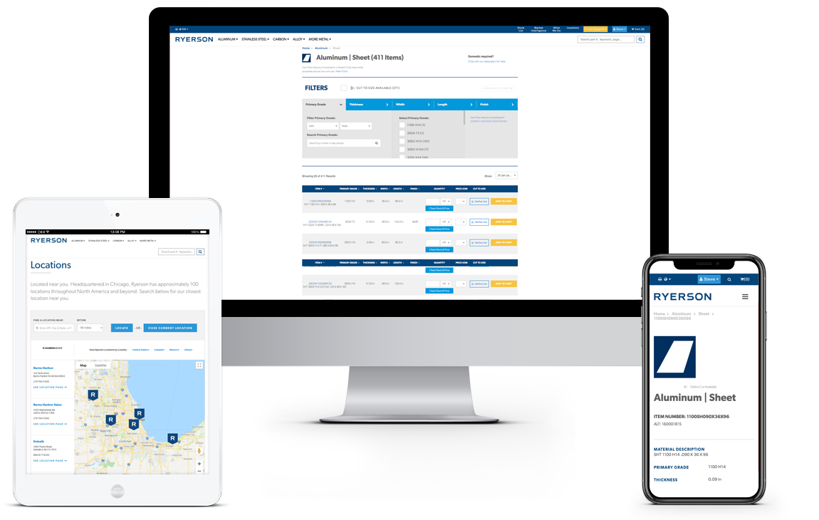
Ryerson is one of the largest metal distributors in the US. The core problem wasn't traffic or brand recognition. It was the products. Metals have precise attributes varying by fractions of a millimeter across 50+ cuts per page. The existing site made comparison nearly impossible.
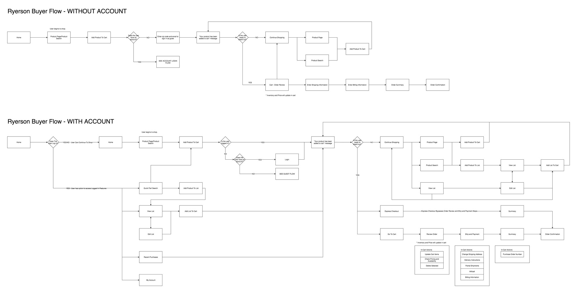
How existing users shop — flow analysis
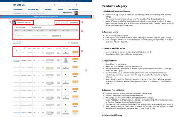
Phase 1 — Key Improvements
Six Design Decisions That Changed Everything
The basis of our idea came from organizing the clutter we were witnessing. There were clear shortcomings in some areas, while others we learned from user and staff feedback. As we started, we focused on cleaning up the product listings, product details, and checkout process to make everything easier to read and more intuitive to use for both returning and new customers.
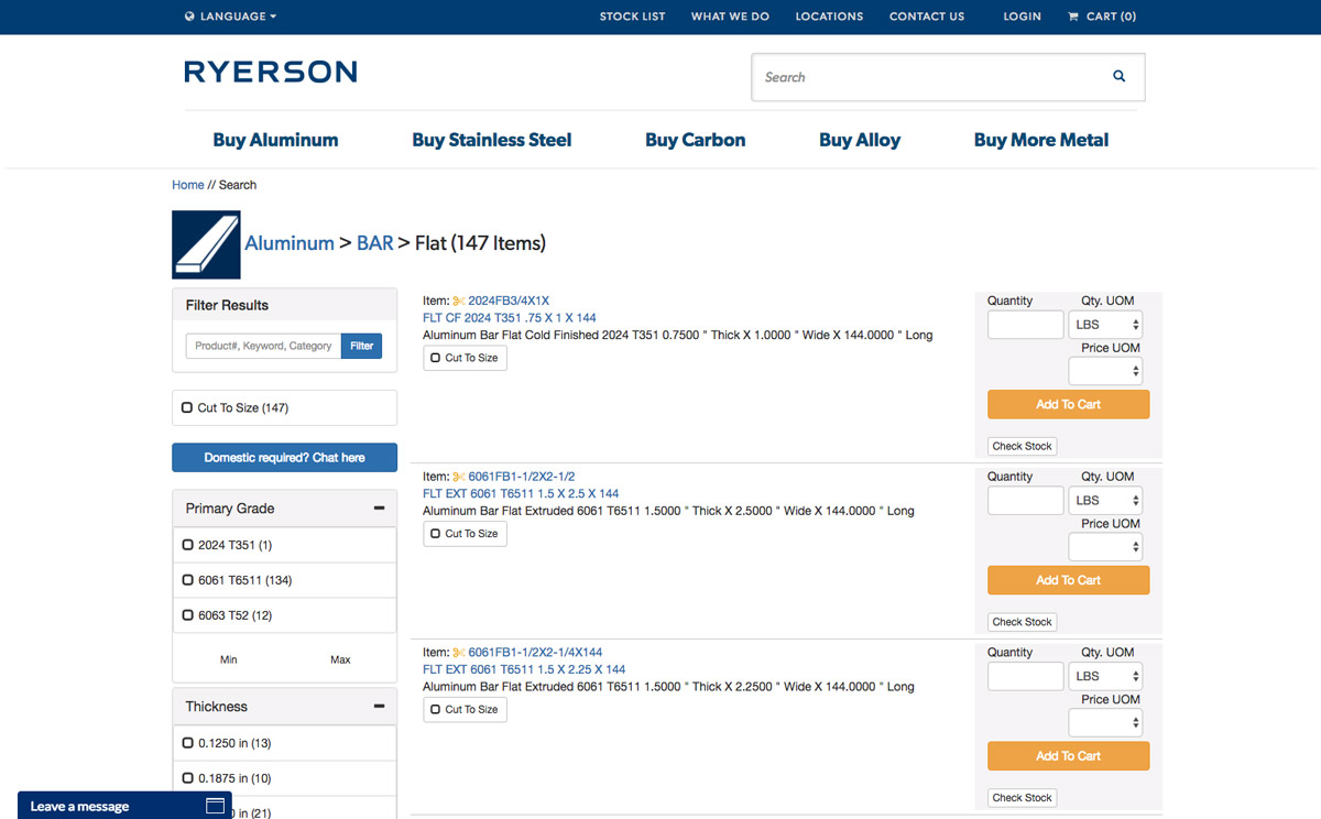
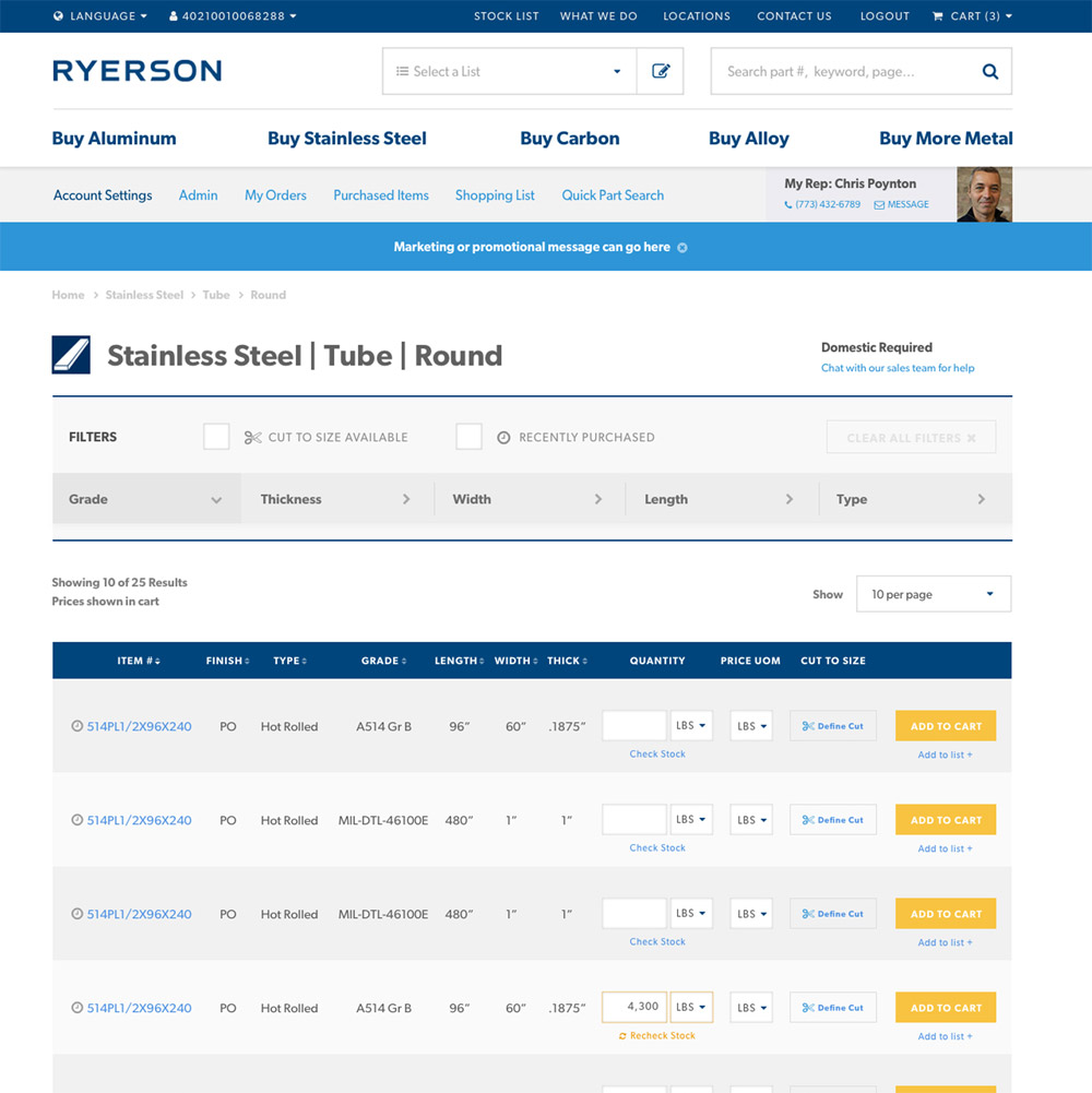
Original Ryerson product listing
📋
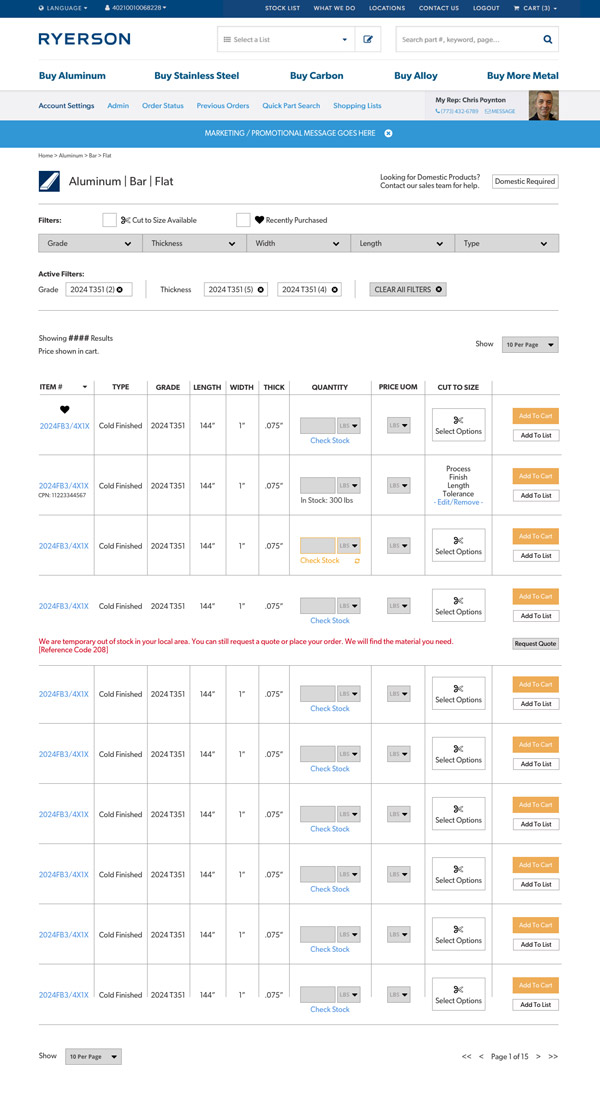
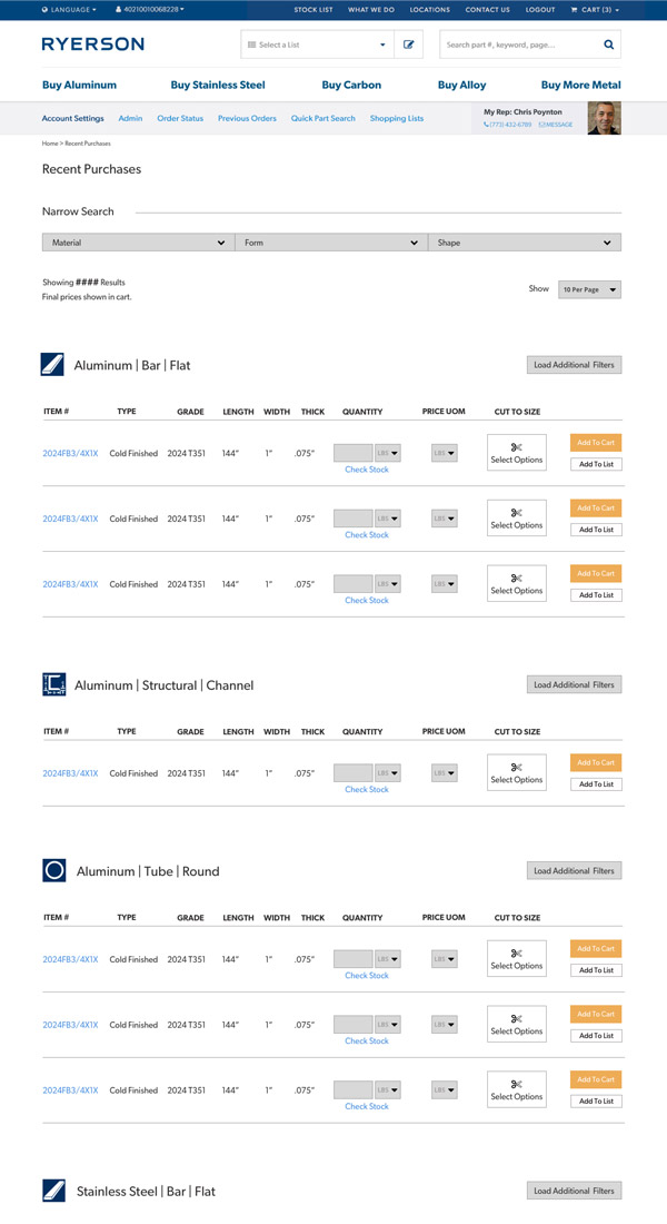
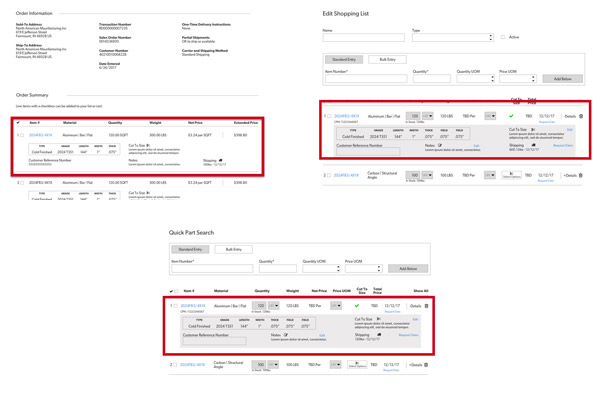
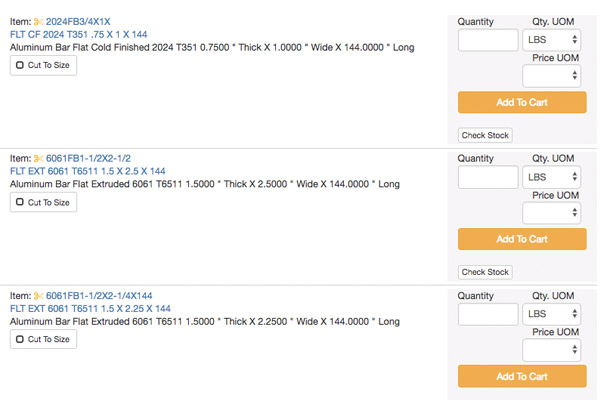
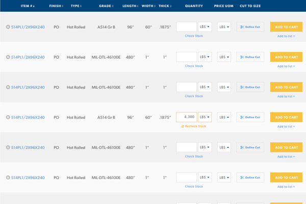
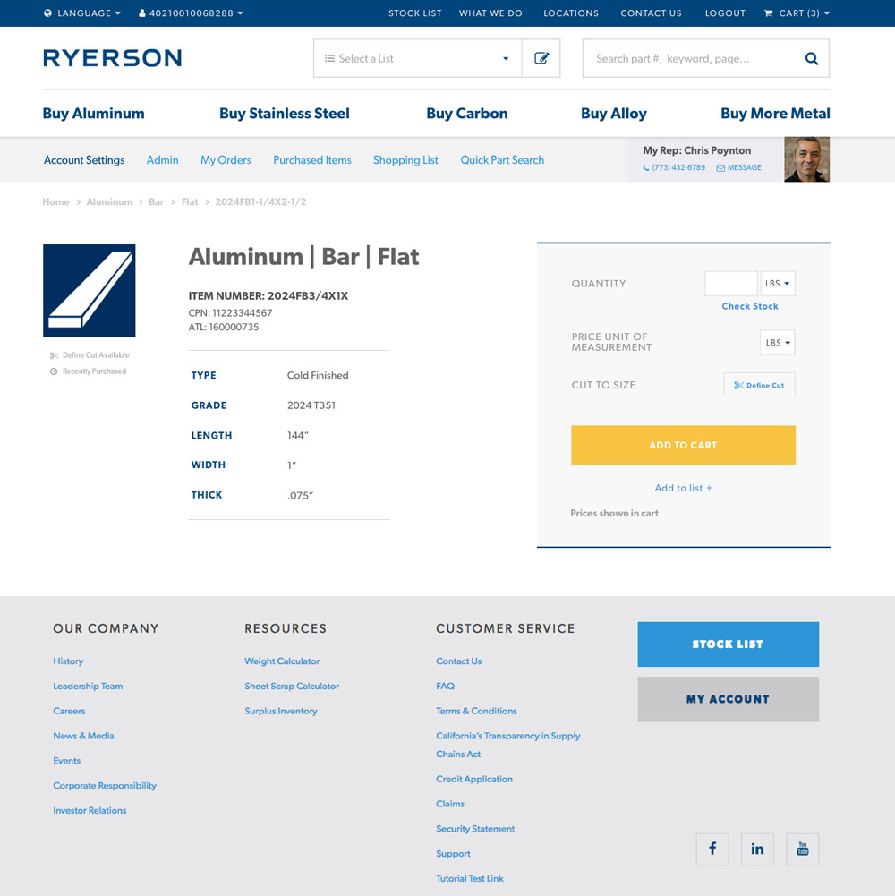
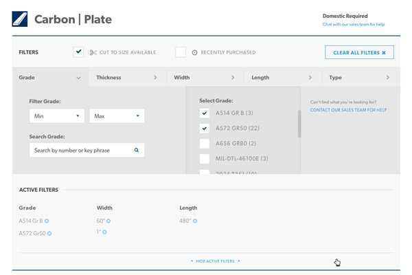
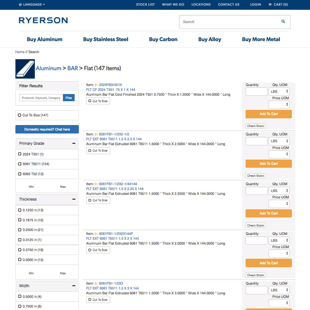
Scannable Rows
Changed the layout to use rows of data rather than stacked product listings. Since all products on a page share the same metal, type, and cut, rows let users find a base attribute and quickly scan for minor dimensional differences, which are the actual differentiators.
🔽
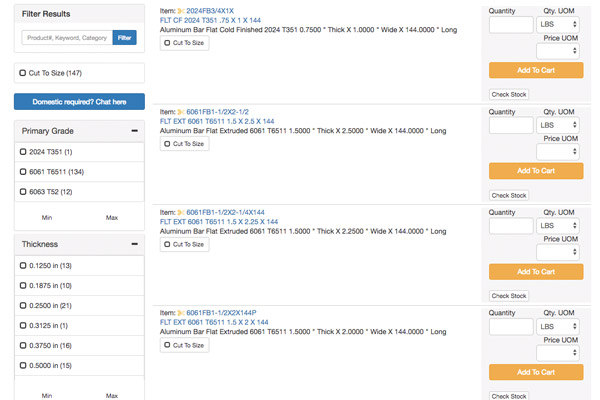
Improved Filters
Moved from sidebar to top of page. Made multi-select easier, added active filter chips with individual clear (×), and surfaced Cut to Size and Frequently Bought prominently. Users no longer had to navigate back through the filters to clear an option.
📊
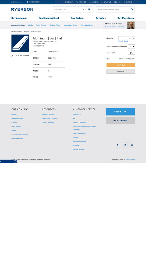
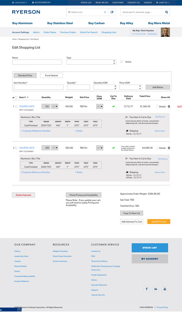
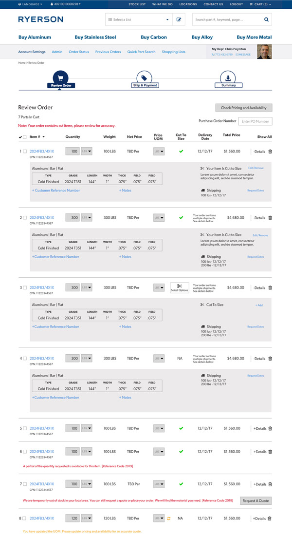
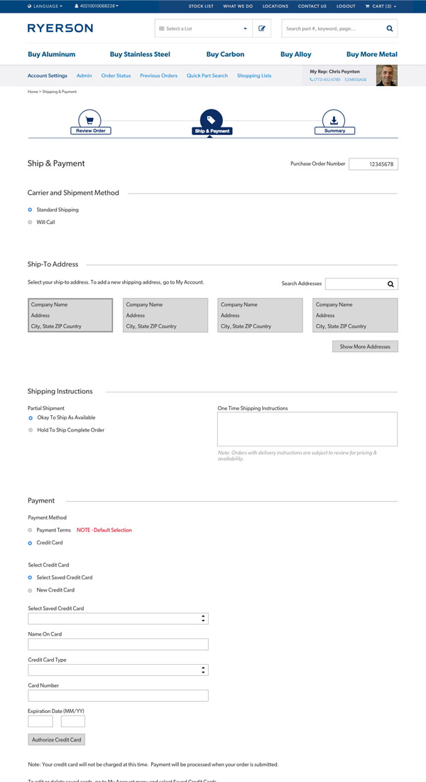
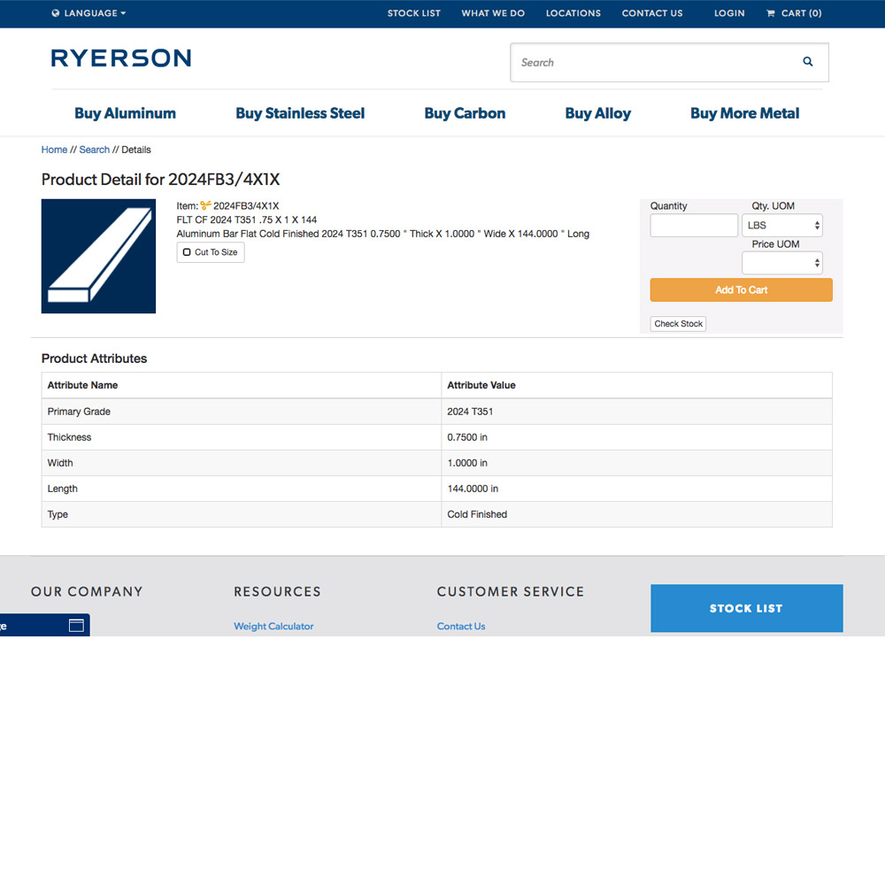
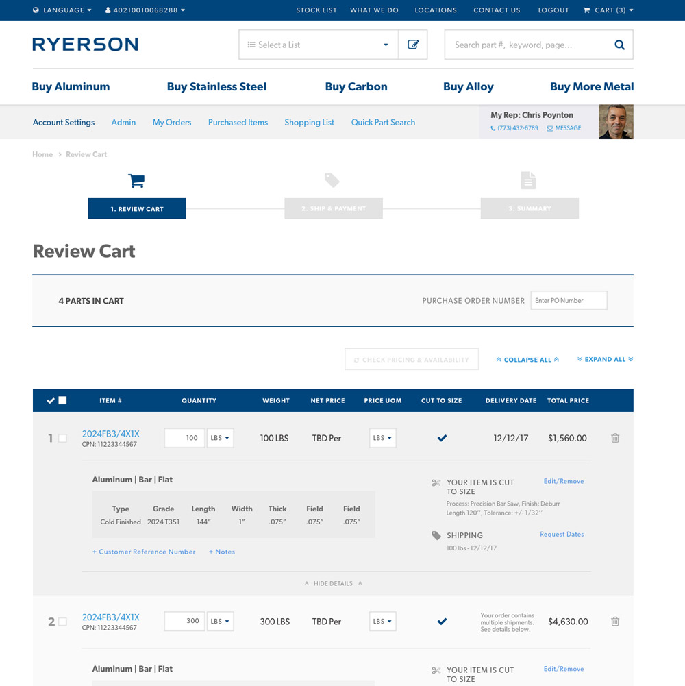
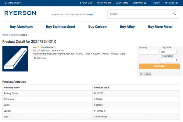
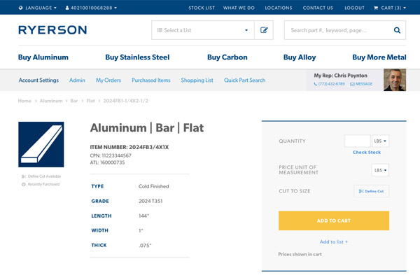
Digestible Information
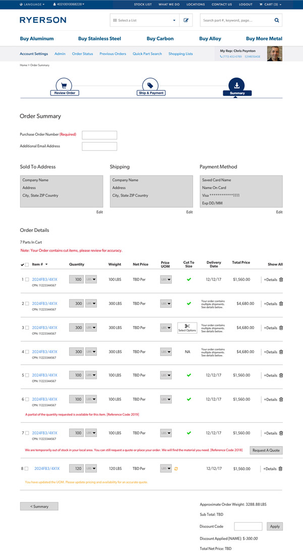
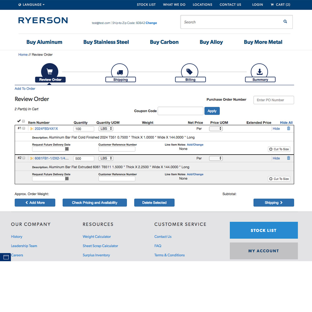
The old site had poor visual hierarchy and long-form numbers. We fixed hierarchy, replaced number strings with easy-to-read tables of key attributes, and reduced clutter in cart pages. Also increased font size and spacing, removed unnecessary elements like manual stock-check fields.
🔗
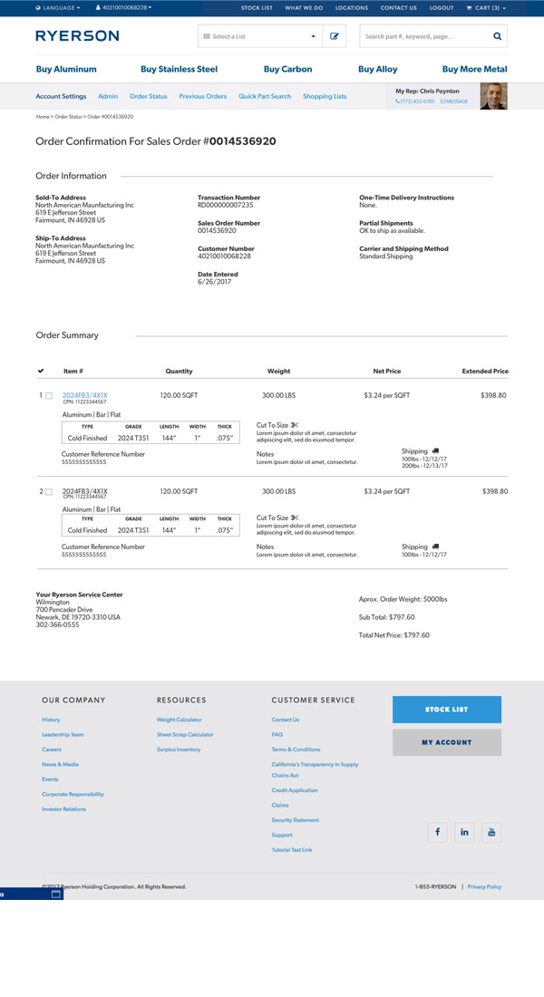
Consistency Across 20+ Templates
As we completely redid over 20 page templates, we kept similar patterns in the same location, with the same color and icon indicators. Elements like "Cut to Size," cart interactions, and checkout items behaved identically everywhere.
⚡
Quick Wins
We incorporated marketing and UX best practices throughout. One addition was the logged-in header showing the user's rep information, encouraging customers to call if they had questions. We also used Ryerson's bright orange highlight color to indicate important actions (checking stock, adding to cart), drawing attention and easing nerves as the user progresses.
📄
Documentation
We created two extensive documents: one calling out specific elements and explaining the UX and design best practices behind them, and a 50-page annotation document explaining all functionality to the development team. Full documents, wireframes, and designs available upon request.
Wireframes
Wireframe — product categoryWireframe — product detailWireframe — related productsWireframe — shopping cartWireframe — cart/checkout 5Wireframe — search and productsWireframe — order summaryWireframe — order confirmation
Additional Deliverables
Consistent patterns across templatesNavigation improvements50-page annotation document delivered to the development team
Before and After
◀▶
BeforeAfter
Category Listing
◀▶
BeforeAfter
Category Listing - Close Up
◀▶
BeforeAfter
Category Listing - Filters
◀▶
BeforeAfter
Product Details
◀▶
BeforeAfter
Checkout - Review
◀▶
BeforeAfter
Checkout - Shipping
Note: for Phase 1 of this project, I worked on UX and partnered with a visual designer for the final designs.
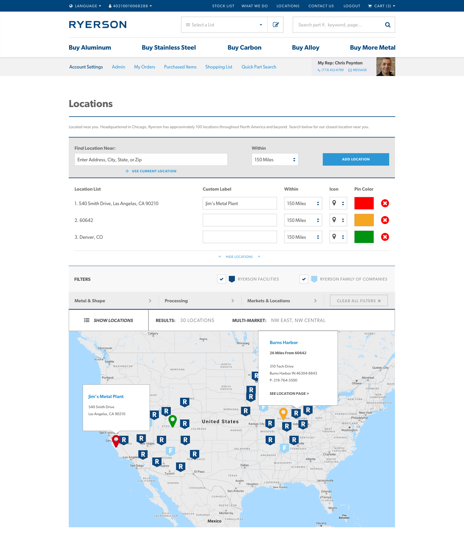
Phase 2 — Location Finder
Reimagining How Customers Find Ryerson
After a successful update, Ryerson came back to Orbit to build out additional functionality. This time, they wanted to improve their map feature to better showcase locations and shipping lanes, while taking into account the proximity of customer locations. We worked with their developers to create a custom experience that completely reimagined their location finder, matching the recently updated designs. Unlike Phase 1, I worked by myself on Phase 2, using the existing design system to establish both the UX and UI.
Challenge: Multiple Locations
When we started, the project was only intended for users to enter one location. As we moved through discovery and design iterations, it was decided that customers may want to enter multiple locations at once for a holistic view of their options. We iterated on the location search multiple times, creating a solution that allowed users to add multiple locations and further add custom labels, colors, and icons to clearly differentiate their locations from Ryerson facilities on the map.
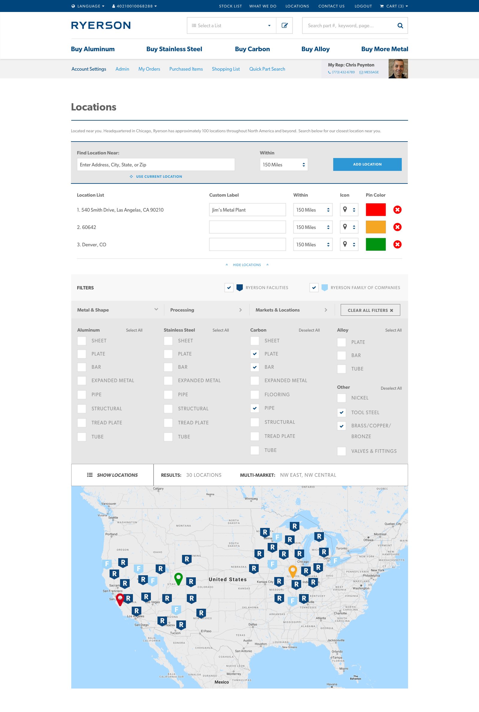
Challenge: Facets and Filters
We needed to show Ryerson and Ryerson Partner facilities, while also providing an option to filter by the same criteria users shop by: Metals, Processing Options, and Markets. This required a large filter set with toggles for each category (matching existing designs), and quick interactions to select or clear all for faster navigation.
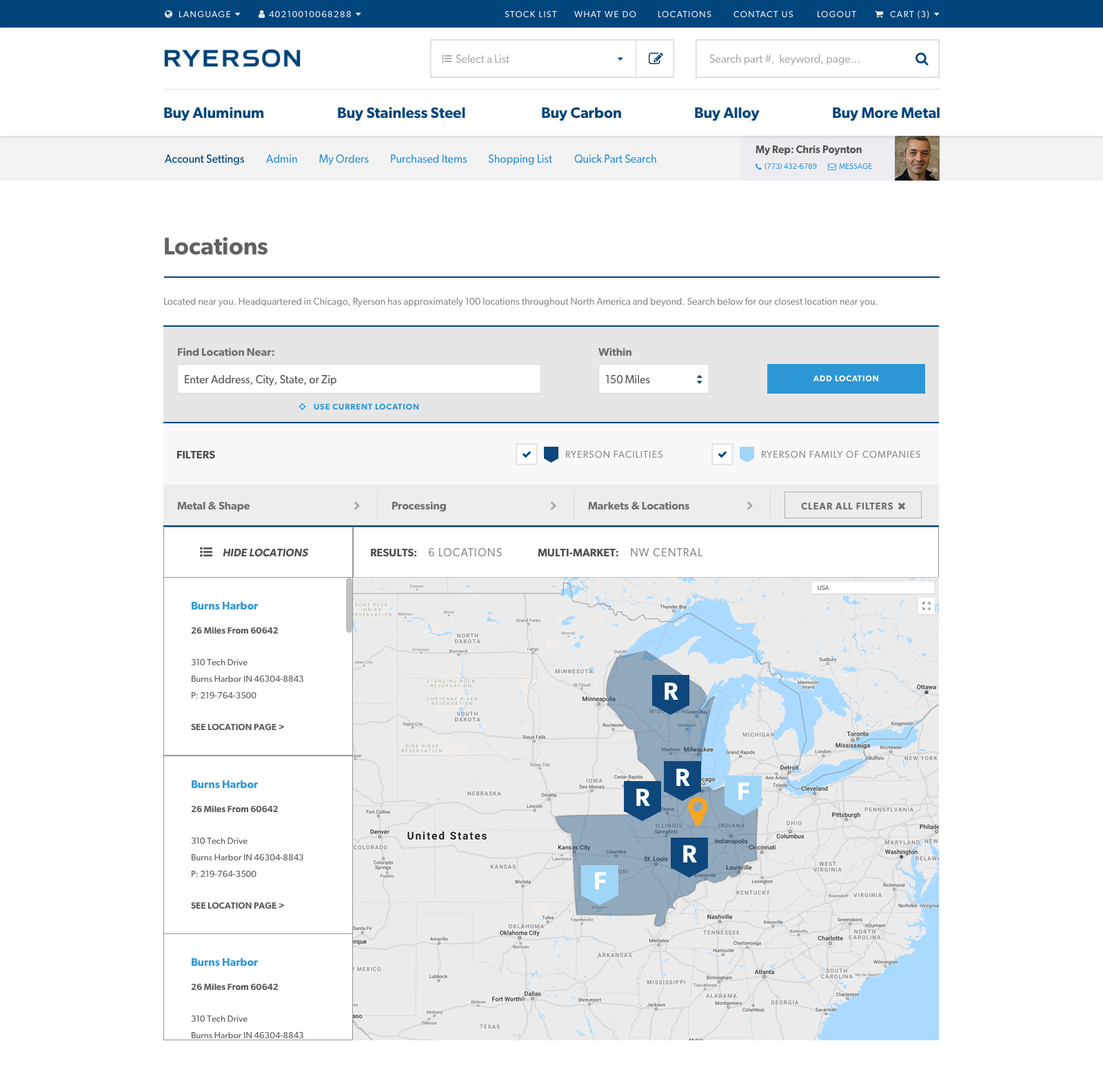
Challenge: Map Functionality
The map itself had to account for over 100 Ryerson locations, plus custom locations users could add. To prioritize the initial map view, we hid the list of results in a toggle, focusing on the map pins. On click of a pin or the results toggle, a full list of locations and corresponding contact information would appear with the desired location highlighted.
Multiple locations with custom labelsFacets & filters by metal typeMarket highlight & results sidebar